
New Direction
It seems my design direction was a bit off course. This, I suppose, is why I'm paying 75 grand to go to school...thanks Troy.
How do you design a website that appeals to non-design-saavy users? What design elements make a web app usable, approachable and simple without over-styling? I think we all know how to build accesibility, but designing accesibility takes a little more finesse and a good understanding of graphic symbolism, color theory and user psychology. And not the psychology of average user demographics (which is what we learn in Interface Design 101), but the psychology of your users.
Good designers borrow, great designers steal. Lets see how the masters do it:
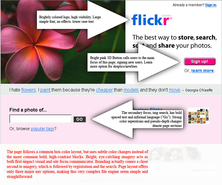
What's easier to use than flickr? Above is a screenshot of the splash page (if you can call it that). This page seems to have been intended to simplfy the monstrous code that makes flickr work into the web app equivalent of velcro strapped sneakers.
How do you design a website that appeals to non-design-saavy users? What design elements make a web app usable, approachable and simple without over-styling? I think we all know how to build accesibility, but designing accesibility takes a little more finesse and a good understanding of graphic symbolism, color theory and user psychology. And not the psychology of average user demographics (which is what we learn in Interface Design 101), but the psychology of your users.
Good designers borrow, great designers steal. Lets see how the masters do it:
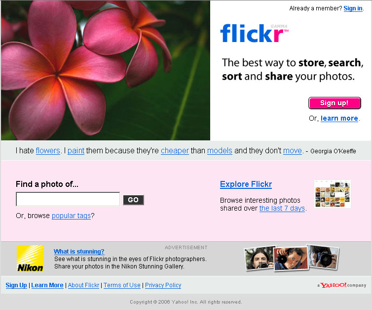
What's easier to use than flickr? Above is a screenshot of the splash page (if you can call it that). This page seems to have been intended to simplfy the monstrous code that makes flickr work into the web app equivalent of velcro strapped sneakers.
posted by toure
![]()

0 Comments:
Publicar un comentario
<< Home