26.10.06

A Good Web Site is . . .

". . . good web designs use visual cues to tell visitors how to navigate, show inter-relationships between content elements, weigh the importance of content, indicate content categories and hierarchies, and convey the type of content. "

-Jim Howard
02-Apr-2004
http://www.cmswatch.com/Feature/102-Web-Accessibility

I like that.

23.10.06

Case Study: Builder

Builder.au is a site after my own heart. Aside from the massive banner heading, the page is Web 2.0 at it's finest (look at the little faux-MSN icons!). Not quite flickr in its simplicity, but still very clear and bright.

http://www.builderau.com.au/


You can't miss the huge, glaring feature article graphics and the splashes of web2.0 orange everywhere. Cliched, but the general feel of the page is actually warmer because of it. The next step for Architect, I suppose, is some kind of happy medium; not quite the flickr day-care center approach, but much less than this. Hmmm . . .

New Direction

It seems my design direction was a bit off course. This, I suppose, is why I'm paying 75 grand to go to school...thanks Troy.

How do you design a website that appeals to non-design-saavy users? What design elements make a web app usable, approachable and simple without over-styling? I think we all know how to build accesibility, but designing accesibility takes a little more finesse and a good understanding of graphic symbolism, color theory and user psychology. And not the psychology of average user demographics (which is what we learn in Interface Design 101), but the psychology of your users.


Good designers borrow, great designers steal. Lets see how the masters do it:


What's easier to use than flickr? Above is a screenshot of the splash page (if you can call it that). This page seems to have been intended to simplfy the monstrous code that makes flickr work into the web app equivalent of velcro strapped sneakers.


The List: v1.0

Surprisingly, this project needs more than my overactive ego to run properly. It's true.

General

  • login/registration/session functionality
  • organized, flexible data tables
  • smooth info design

CMS

  • basic add/edit/delete functionality
  • php-write class for html pages
  • in-browser text editor
  • visual heirarchy feedback and editing
  • mutli-project management

HTML PageMaker

  • standards-compliant output
  • php-variable markers
  • flexible/comprehensive page skeleton

Template Engine

  • new stylesheets w/php markers
  • thumbnails
  • dynamic flash preview gallery(?)

Its seems like less than it actually is. The bulk of my production will have to be dedicated to finding and testing code solutions until I find all the pieces, and all the pieces that make those pieces work, and all the pieces that make those pieces look good doin it.

Design Evaluation

As of this post, this is the current state of the Architect Headquarters:


(click to view screenshot)


In contrast, here are the homes of some of the competition:

The HTML Generators...
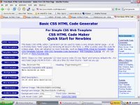


And the Open CMS's...


Without even enlarging, we can tell that there are two distinct styles in use here: Web 2.0/Trendy/Sleek and Web 0.7/Deprecated/Crap. Why are the generators so bad? Well, the ability to produce HTML is pretty much useless without more advanced coding knowledge for style and behavior. These sites serve no modern purpose on their own (other than furthering my research).

The CMS sites are a part od a new wave of dev style that has just recently taken on the Web 2.0 style guide because they know anything else is unprofessional nowadays (don't believe me? Check out Xerox and IBM's new hip gradient touches).

I intend not to follow the Web 2.0 design parade, but there are some very usable and accesible parts to that movement.

Competitive Analysis: vol2

I covered my intial analysis is my Research Document, but I'll summarize:

Blogger.com is pretty much the top dog in the shallow end my pool of competitors. Good news is; the design is solid, the interface is simple, user feedback is efficient and few flaws get in the way of a very smooth process flow. Bad news? The deeep end of that pool holds all those darn open-source content management systems riddled with usability no-no's and steep learning curves. I decided that since Blogger is more successful than any of those home-brewed versions, it should be my best target. I will, however, take time to note design and usability choices of more popular CMS's.

View the Research Document

Opening Day...

This blog is meant to track my progress through the design portion of my 20-week senior project life cycle. Intent and outcome, however, are very rarely one.